Background
Hortex offer Horticulture, Viticulture, Vineyard Maintenance and Management around the Marlborough area. They reached out to us and asked us to create their brand and brand identity. The most important thing for them was that they wanted to be seen in the local and viticulture community and have a brand that stood out.
Challenge
To Create a clear brand that is classic, timeless and modern that represents them as a new company and sets them apart in their market.
Result
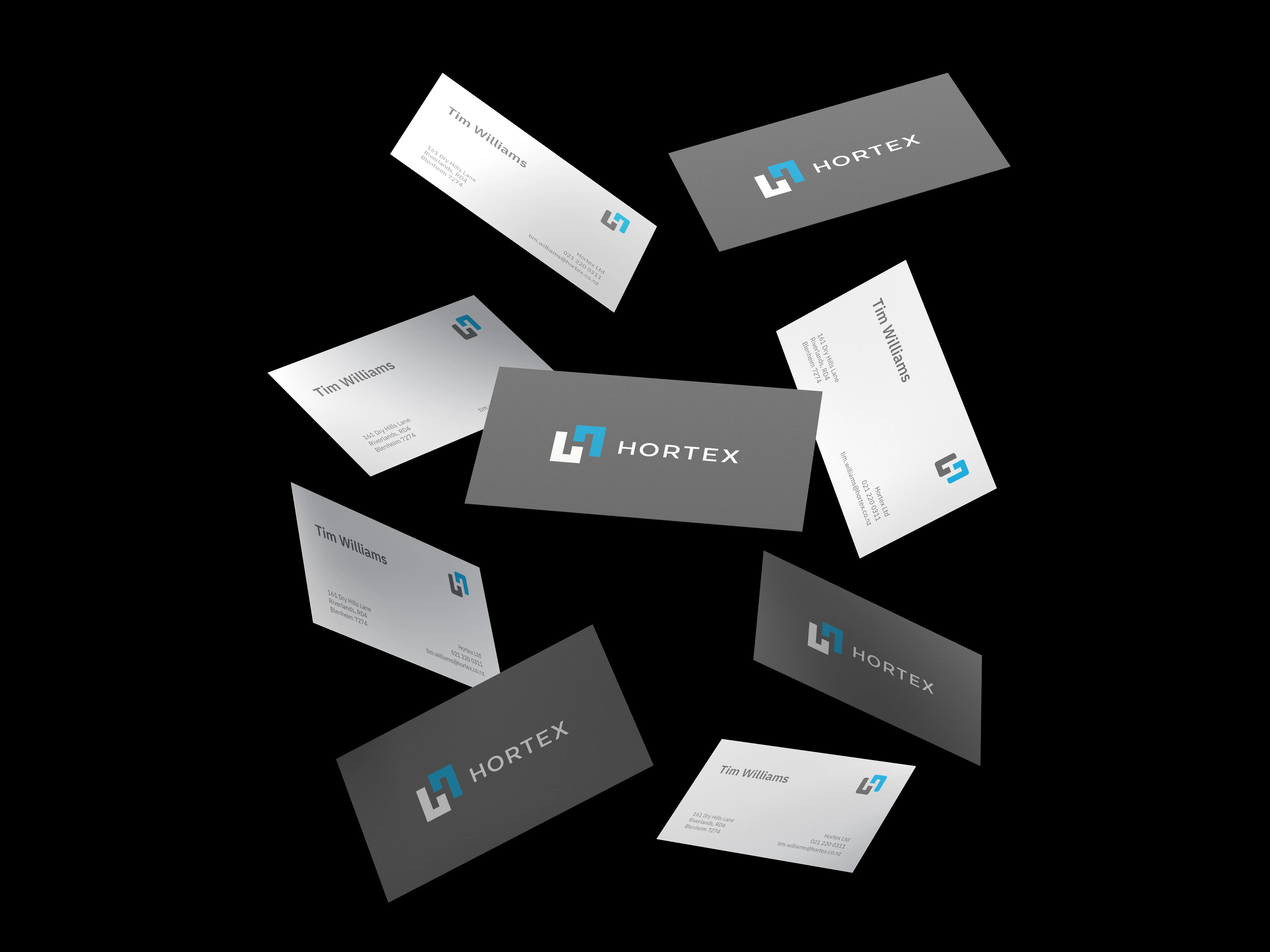
A strong logo that is powerful to stand alone to suit different design modes of communication. It has a particular relationship with the Hortex name. The Logo Type has been carefully chosen for its modern and yet refined, highly legible style, which has been further enhanced by the use of upper case letters.
The corporate logo is presented through the use of colour as well as shape and form. The two corporate colours are blue and dark grey. It is a fresh and appealing blend of colours chosen for their strong combination


